UCSD Registration Overhaul


Problem Statement
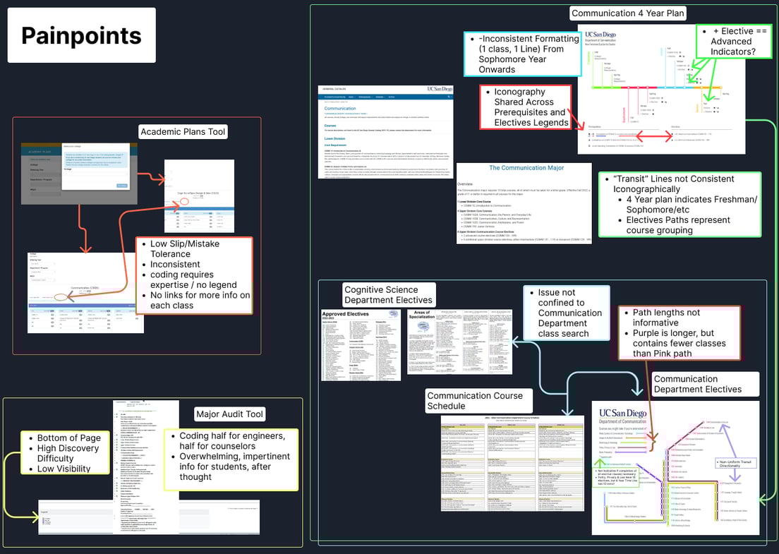
As a transfer student, I received a list of an idealized path to earning my degree. When visiting my major's department and Warren college’s counselors, I received more handouts with contrasting information, and a degree audit tool that was difficult to parse relevant information. While trying to juggle all of these resources, I would register for a class that I thought fit my elective courses, and I wouldn't find out until years later when I switched majors that it didn’t.
These experiences sparked the questions -
A) how can we enhance registration process by narrowing the gulf of evaluation for students between all of these tools,
and
B) can we better equip major department and academic counselors to expedite the process for helping students going over the degree audit or considering switching majors?
Existing Issues
Ideation
Discovery and Research
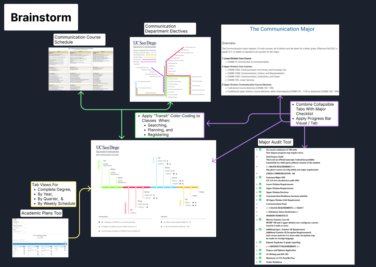
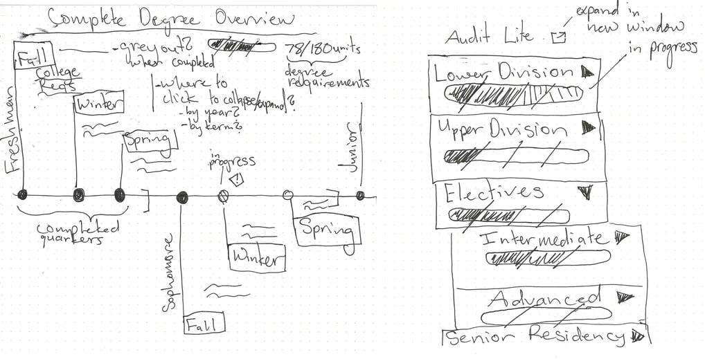
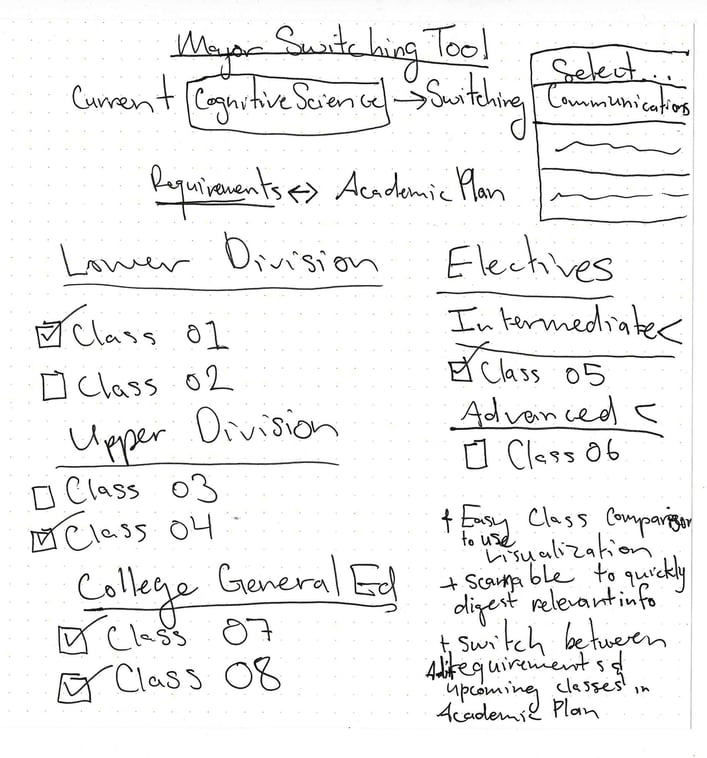
- The tools were merged to consolidate functionality and improve legibility of the degree's overall completion.
- For the student and counselor stake holders, the new workflow improved the process to apply for classes with the addition of labels connected to degree audit requirements.
- The design allowed students to infer what classes from the major are available in upcoming quarters, reducing time spent searching between physical handouts or the digital tools for relevant information.
- Condensed students' registration roadmap to better visually inform those seeking to switch majors.
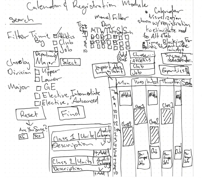
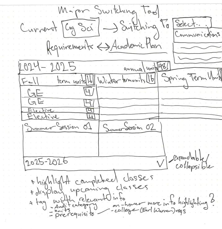
- In prototyping, it was found to be beneficial to create time blocks to holistically consider every part of student life as possible. From athletics, to jobs, or clubs, visualizing time constraints during registration from these activities created clarity for the upcoming academic calendar.
- A wish-list function was added to reduce decision fatigue for students that are pursuing degrees with potentially overwhelming class offerings in future quarters. The ability to save classes that students wanted to register for in the future reduced the need to screenshot or keep note of the class in an external tool.
Low Fidelity Mock Ups
Solution
One thing that Don Norman's book "The Design of Everyday Things" suggests is to make tools that employ slipways for when users need to navigate through errors. I wanted to incorporate this mindset by showing students when a class they've registered doesn't fit their major, college, or approved electives lists. If I had known the class was extraneous, I would have wanted something in the system gently reminding me, which is why I have designed a few solutions. Pop up on registration. A warning highlight in degree overview, asterisk * both with mouse hover effects.


Reflection
I would like to have done high fidelity walkthroughs as well as field questions as to what works with the designs. I would query what doesn't work currently for students and counselors and create a list of wants from stakeholders. Being able to test the iterations would have been useful to see what combinations of designs worked best. I'd also like to talk with the developers and maintenance crew to figure out what design changes are feasible and scalable.
I'd want to do more research on the counselor's dashboards. When I went to my major and college's counselors, they were using the websites of my major and writing out by hand what classes I could take. Investing into designing a quickly accessible tool would greatly reduce the cognitive load needed by every student looking to switch their major, as this task may be performed twice, first by the student weighing their options, and then their counselor checking their math. Having a clean visualizer prevents errors like one I had where I took a class I didn't realize until I switched to Communication was not on Cognitive Science's HCI approved electives.
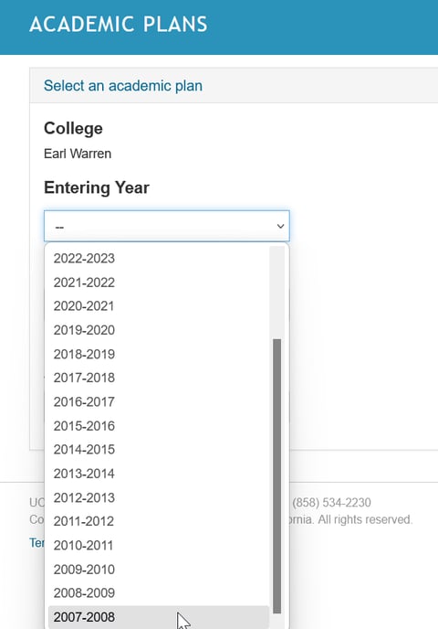
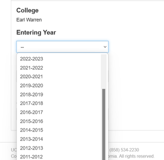
Although this sounds great, a major Switching Tool may get complex and incur a vast tech debt. With every major they have different guidelines about what classes fit their major's bill every year. From the drop-down menu of the class planner had options dating back to the 2007-2008 academic year. That tech debt could possibly be why a tool that I have designed hasn't been made.
The major overview also is fit around majors that have lower class loads. For higher class count and summer classes, these may clutter and overload the main Overview screens. This also only covers a couple of the undergraduate programs, the audit lite views may not translate to graduate studies.
I would also want to eventually expand this overhaul for the financial aid office and the student portal. When I visited the office, it looked like they were accessing information on command line terminals with harsh, radioactive green, serifed fonts on a black void of a background. Creating better presented information could create stronger memorized connections that require a lighter cognitive load from strict, rote, memorization of steps a few lines at a time. Delivering improved dashboard designs would better equip financial aid counselors in assisting students as well as student understanding of their tuition package.